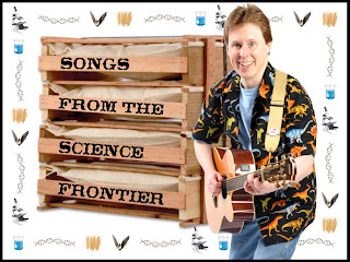
Lisa and Evalyn have been helping me come up with the "cover art" for my upcoming campaign to raise the money to record my new science CD. (Coming July 8!)
The CD is called "Songs From the Science Frontier."
Again, this is not cover art for the CD, necessarily, but just something to represent the project to potential supporters on Kickstarter.com. (You can visit Kickstarter to see what other projects look like.)
Here's my original concept. I thought the text on the crate looked pretty cool.
Option A
Evalyn and Lisa didn't like it because they thought it wasn't science-y enough so I found some science looking items and put them around my head as if I were lost in the world of science.
Option B
They didn't like that either - unsupported objects flying around? They don't get me. Anyhow, Lisa suggested using the objects to make a border.
Option C
Finally, out of frustration, Lisa took the helm and came up with this one:
Option D
Then I thought, well maybe since my own photo will be available in the profile, that I didn't need to be in the picture, so I did this last one. Lisa and Evalyn haven't seen it yet. I'm afraid to show it to them.
Option E
Could you do us a favor, and vote for your favorite in the survey to the right? There is an option if you don't like any of them. Also, your specific comments and suggestions are more than welcome. Please post a comment here on my blog, or on Facebook, or send me an email.
Thanks!


No comments:
Post a Comment